If you have lived through a few decades of design, you know that colours never truly disappear. They simply step out of the spotlight for a while and then return wearing a different outfit. Pastels are a good example. For many people, they evoke memories of 1950s bathrooms in mint and pink, or the softer, sun-faded tones that showed up again in various ways in the 1970s and 1980s. Now, as we move through the late 2020s, pastels are returning yet again as part of the 70-year cycle, but with a more grounded, mature character that suits our present.
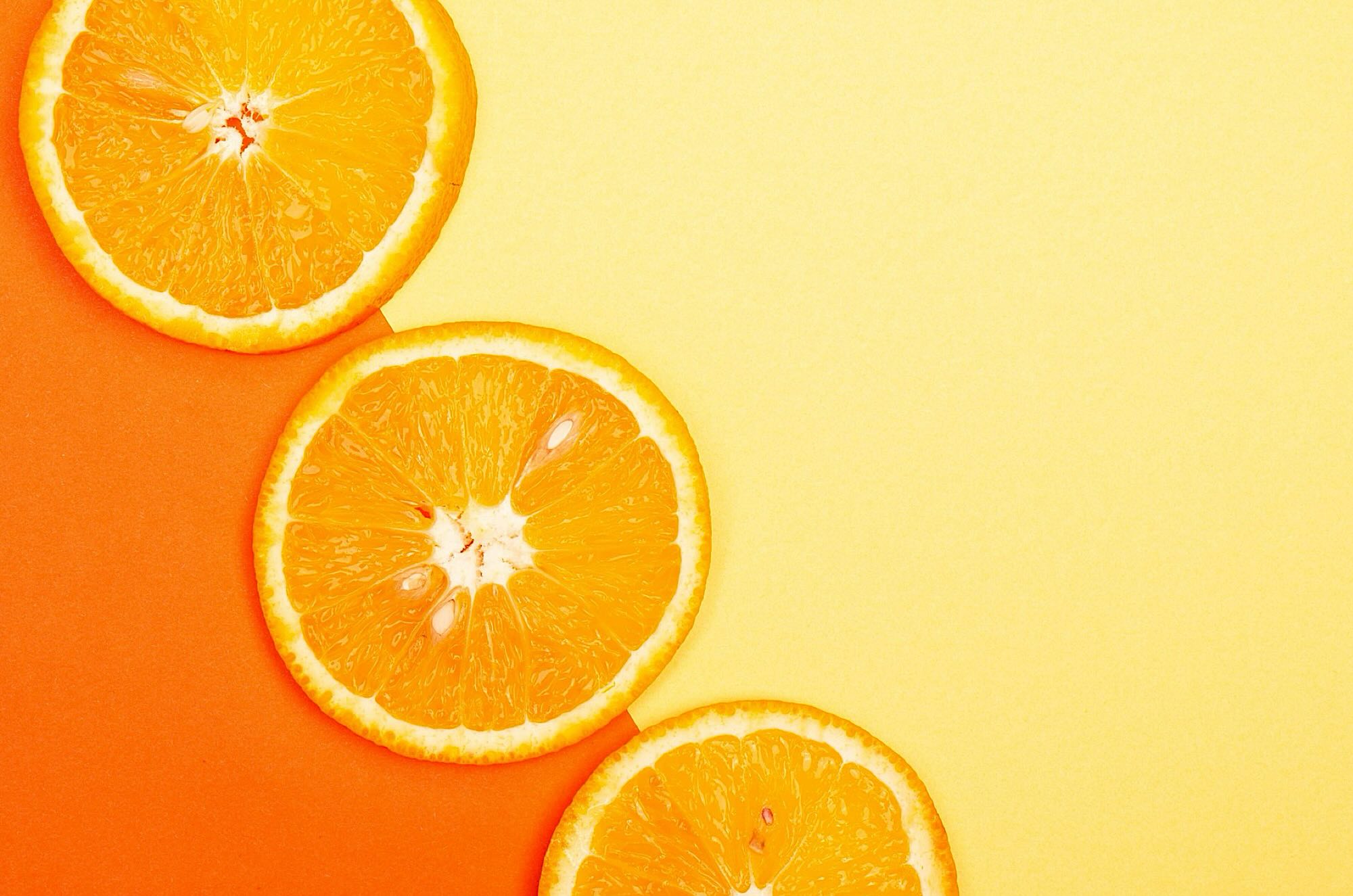
Today’s pastels are not the sugary colours of a nursery or the glossy bathroom suites that might come to mind from old catalogues. They are softer, more complex tones that sit comfortably next to the warm neutrals many people now prefer. Think of a blush that feels like the inside of a seashell, a green that resembles dried sage rather than artificial mint, or a blue with a touch of grey that recalls an overcast sky instead of a bright baby blanket. These colours carry a whisper of their earlier lives in the 1950s and 1970s but have been toned down and weathered, as if time and light have created a patina.
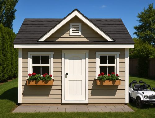
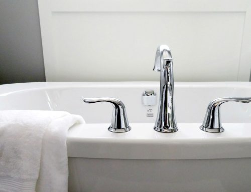
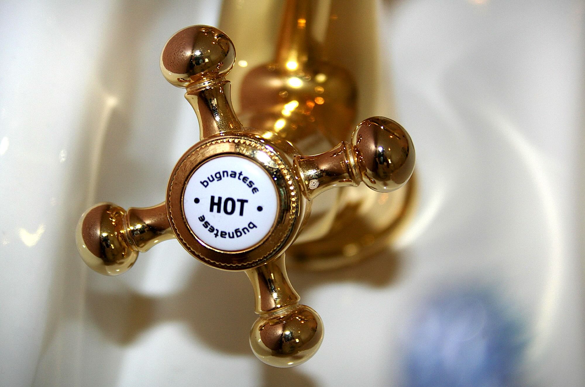
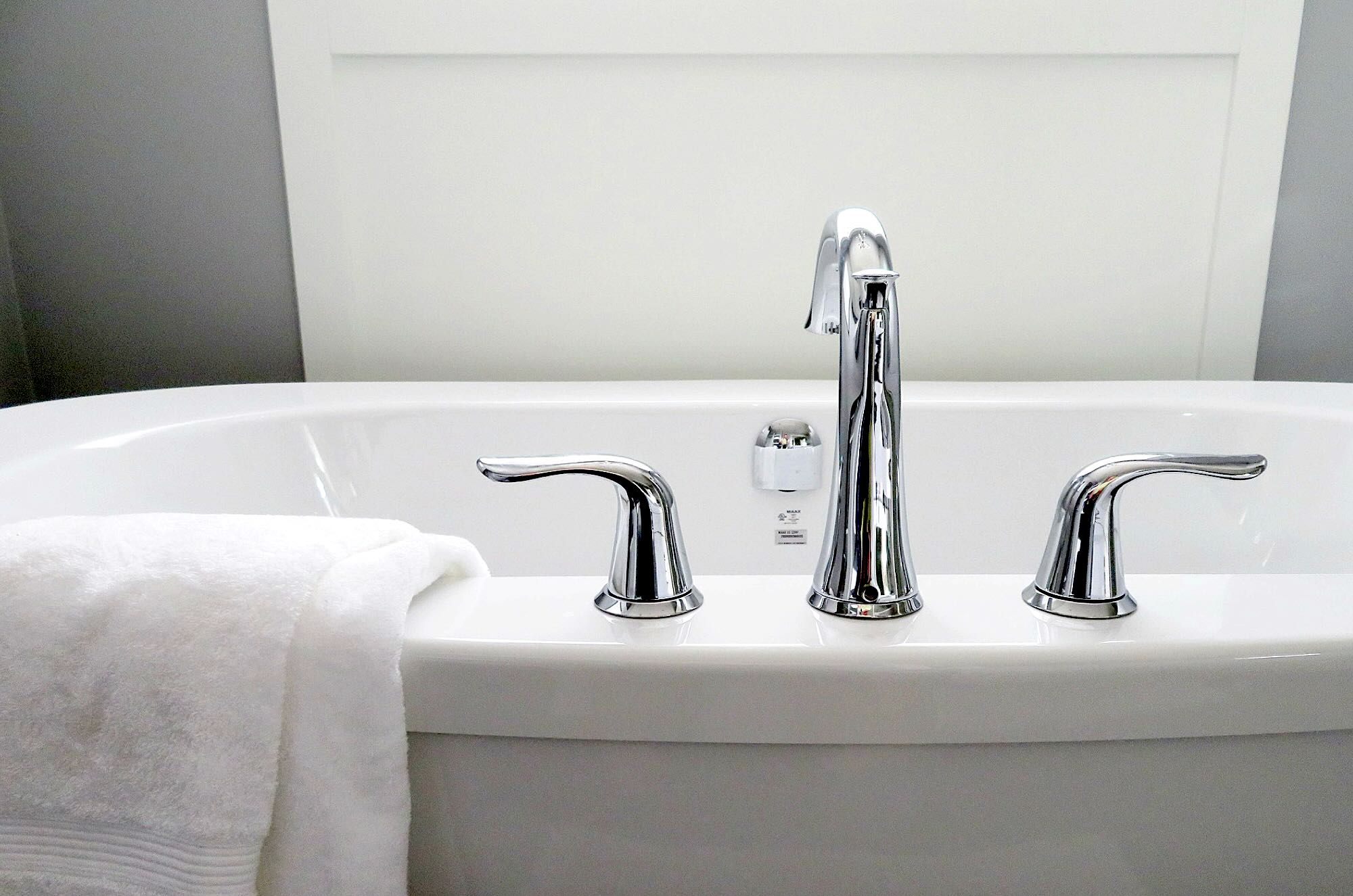
For homeowners considering how to use pastels in 2026, the key is to think about permanence. There is a difference between painting a bedroom wall a soft, misty lavender and installing a full bathroom suite in the same colour. Walls, textiles, and smaller pieces of furniture can be changed fairly easily. Flooring, tile, cabinetry, and countertops are more expensive to alter and often involve more material waste. If you enjoy following design cycles and appreciate colour, it is wise to keep your foundational elements relatively calm and allow pastels to appear in ways that can be adjusted as tastes shift again over time, such as paint or textiles.
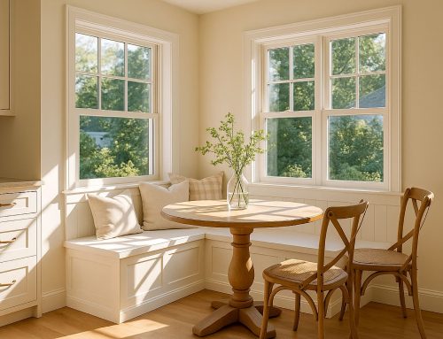
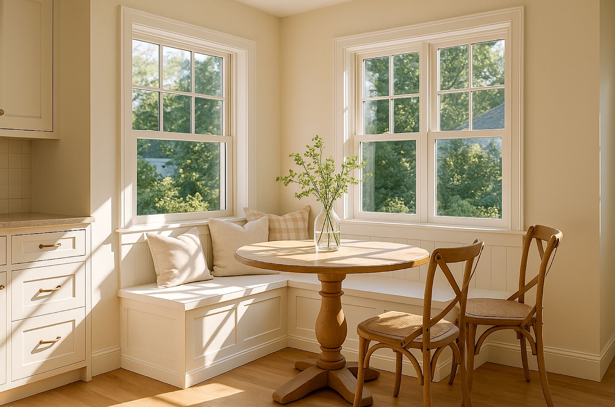
One practical approach is to let the envelope of the home remain within the family of warm whites, beiges, and light greys, then bring pastels into secondary layers. A kitchen might have simple, well-made cabinets and natural countertops, while the walls have a mellow green that feels fresh in the morning light. A bathroom could rely on classic white or stone tile, with pastel paint, towels, and a shower curtain adding personality. In a bedroom, a neutral bed frame and floor can be balanced with a quilt or headboard in your favourite hue.
There is a certain comfort in recognizing that we have seen many of these colours before. They may have framed childhood kitchens or appeared in a grandmother’s guest room. Now they are reappearing in a more measured, thoughtful way, ready to be combined with natural materials, and improved lighting. Recycling furniture with paint that follows the 50 and 70 year cycles will turn casual pieces into items that everyone will cherish.
In planning a renovation or refresh, it can help to ask how you want your home to feel ten or even twenty years from now. If a soft, sun-washed palette still feels appealing when you picture that future, then pastels may have a place in your plans.